Creative concept and Art Direction for Davidoff
‘Evolve Beyond’ Global CX Playbook 2023.
Agency: Live & Breathe
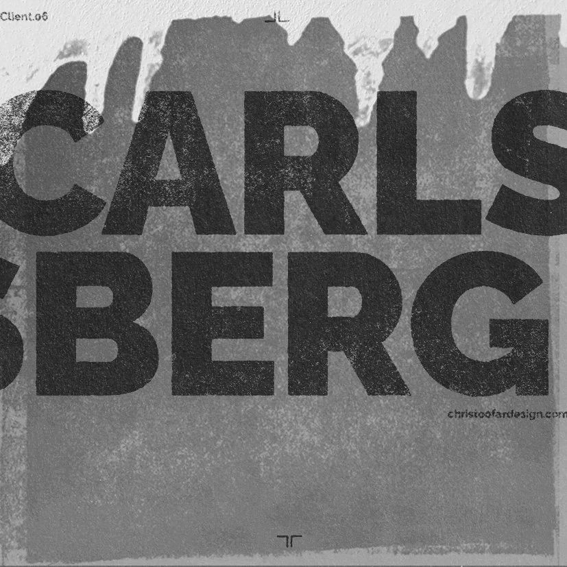
Design and Art Direction for Carlsberg
‘Born To Be Chilled’ summer refreshment
campaign to run across POP and packaging.
Agency:The Marketing Store
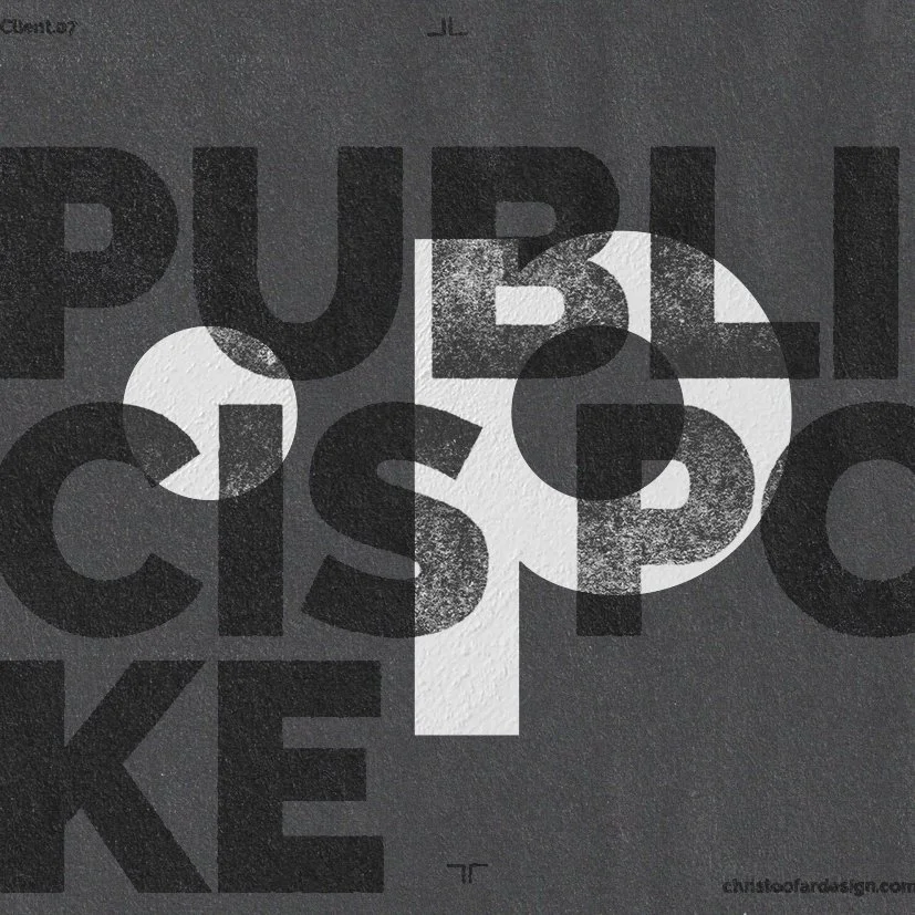
Key visual and wider toolkit redesign for Schweppes. This was quite an extensive project with asset creation ranging from initial key visual through to e-commerce.
Agency: Publicis Poke
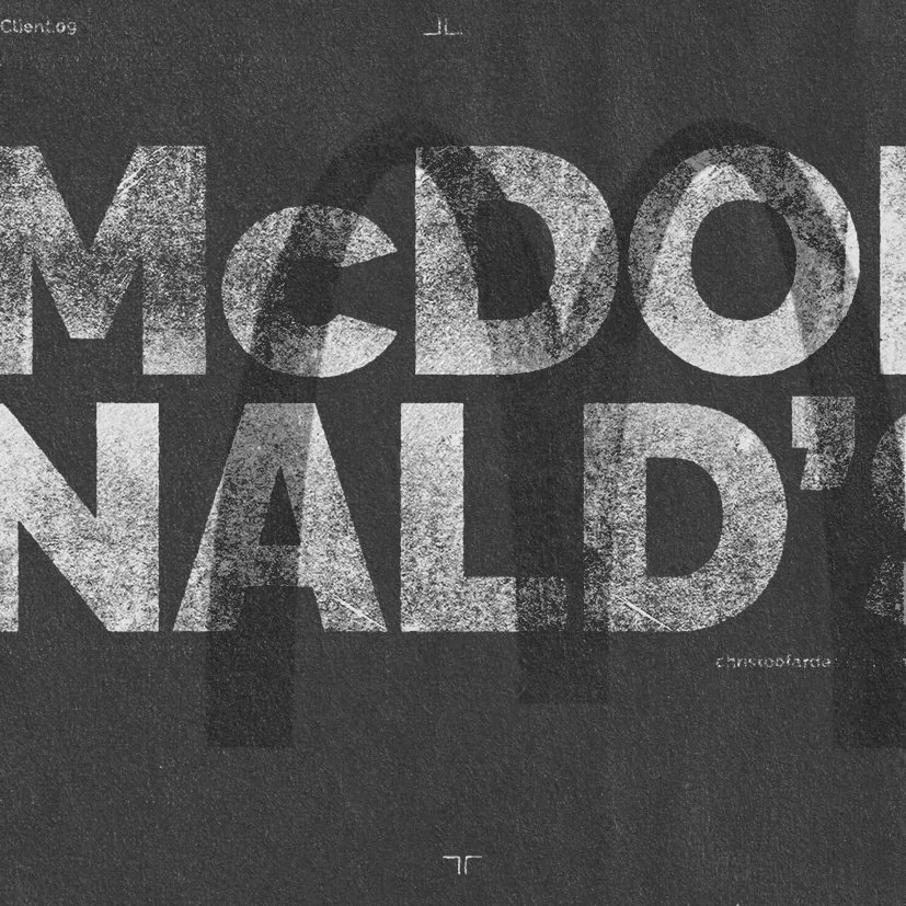
Creative concept, typography, illustration
and art direction for the McDonald’s
Festive Menu campaign.
Agency: The Marketing Store
Winner of 2 bronze awards
for 'Best use of Direct Mail'
and 'Best Brand Build
Campaign' at 2015 DMA's.
Illustration and design for
the National Trust ‘50 things
to do before you are 11 & 3/4’
poster/direct mailer campaign.
Agency: M&C Saatchi
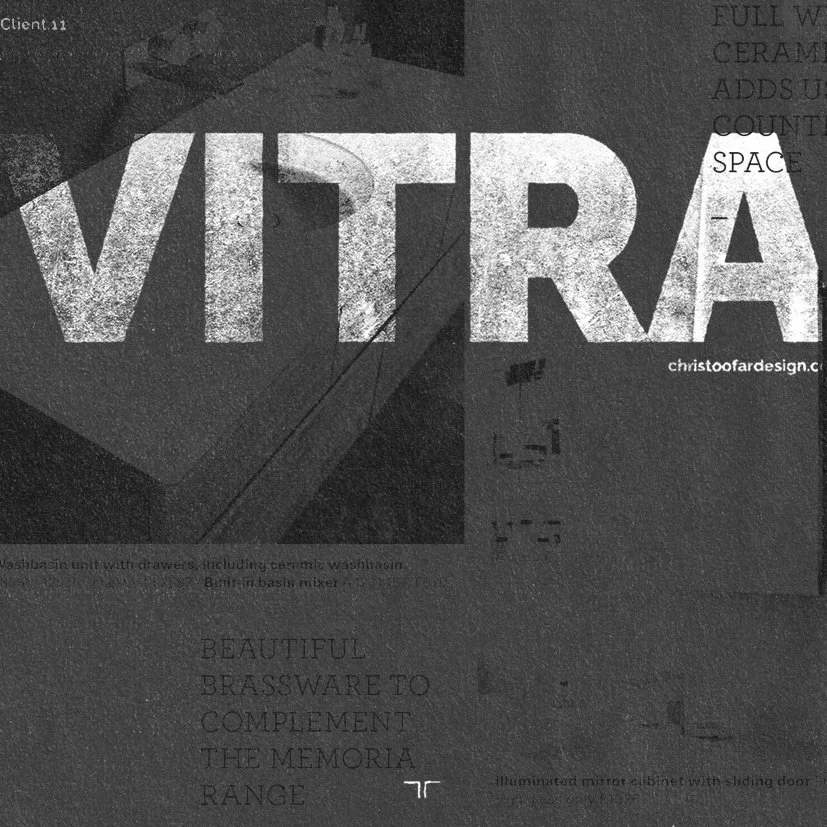
Design and Art Direction of the
Vitra bathrooms brochure.
Agency: JJ Marketing
Creative concept, typography,
illustration and art direction for
the McDonald’s Great Tastes
of America campaign.
Agency: The Marketing Store
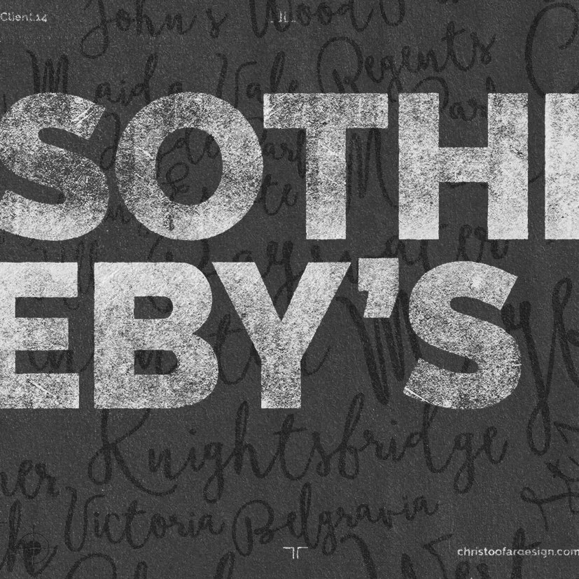
Creative concept, design and art direction
for the ‘So Sotheby’s’ pitch.
Agency: MAYA Marketing
Lockup and key visual design for Old El Paso
‘Make Some Noise’ campaign.
Agency: Publicis Poke
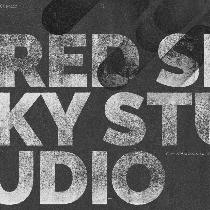
Design and Art Direction for the agency
rebrand of RedSky Studios based in Herts.
Agency: RedSky